

Nanga Magazine - Design History
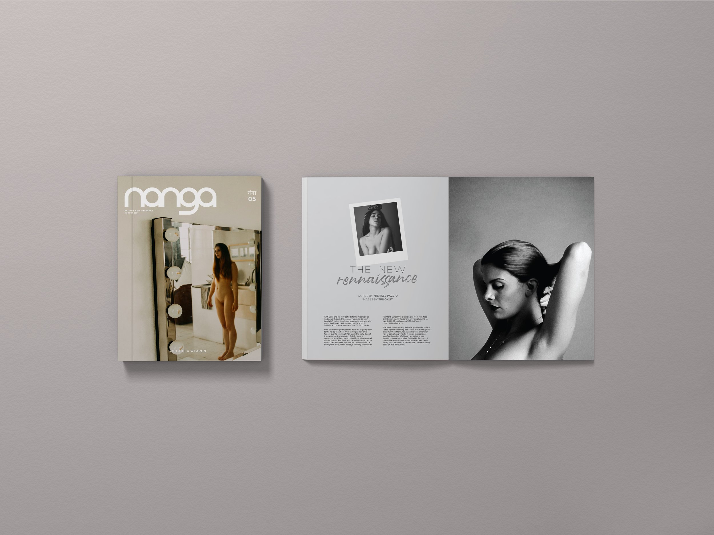
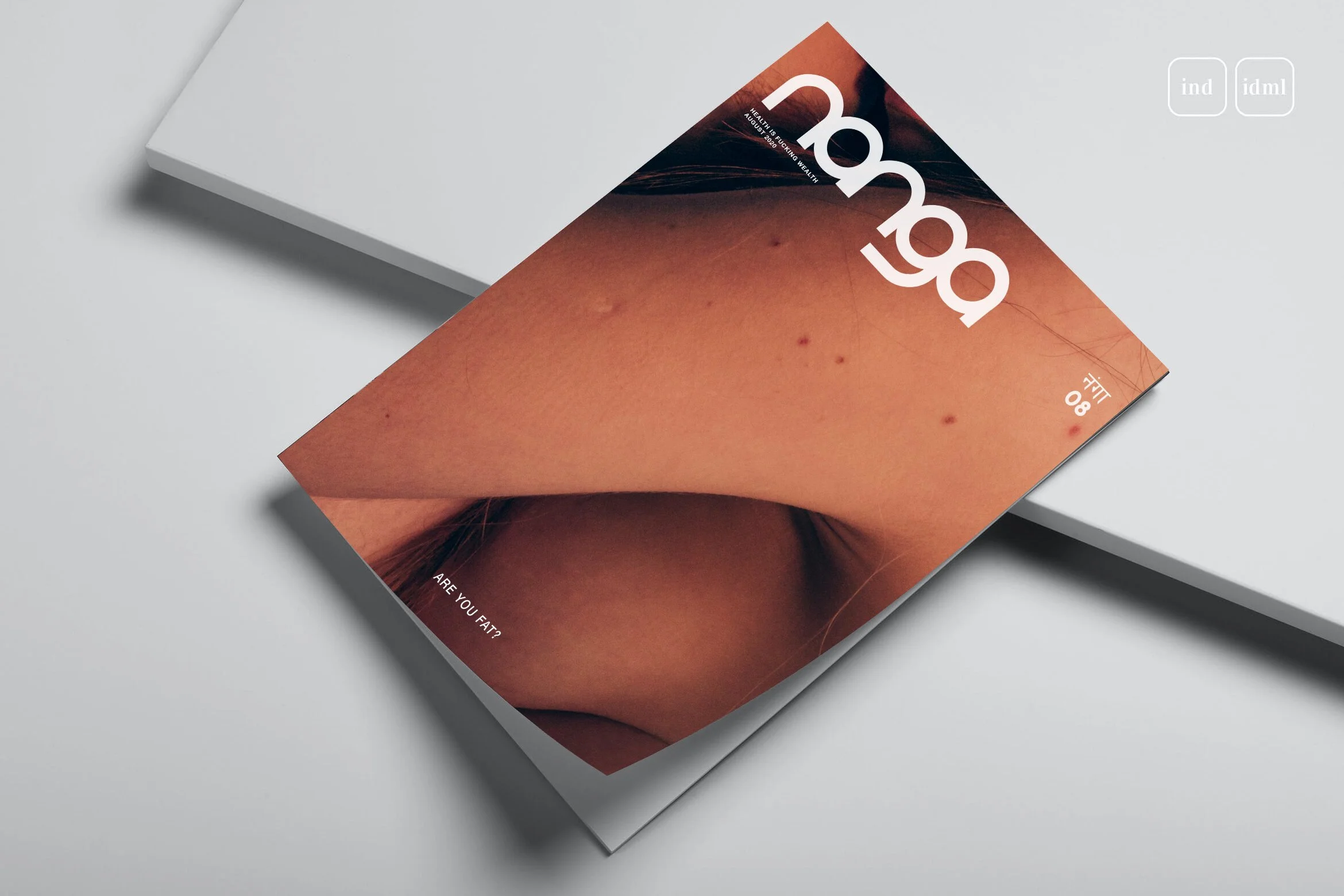
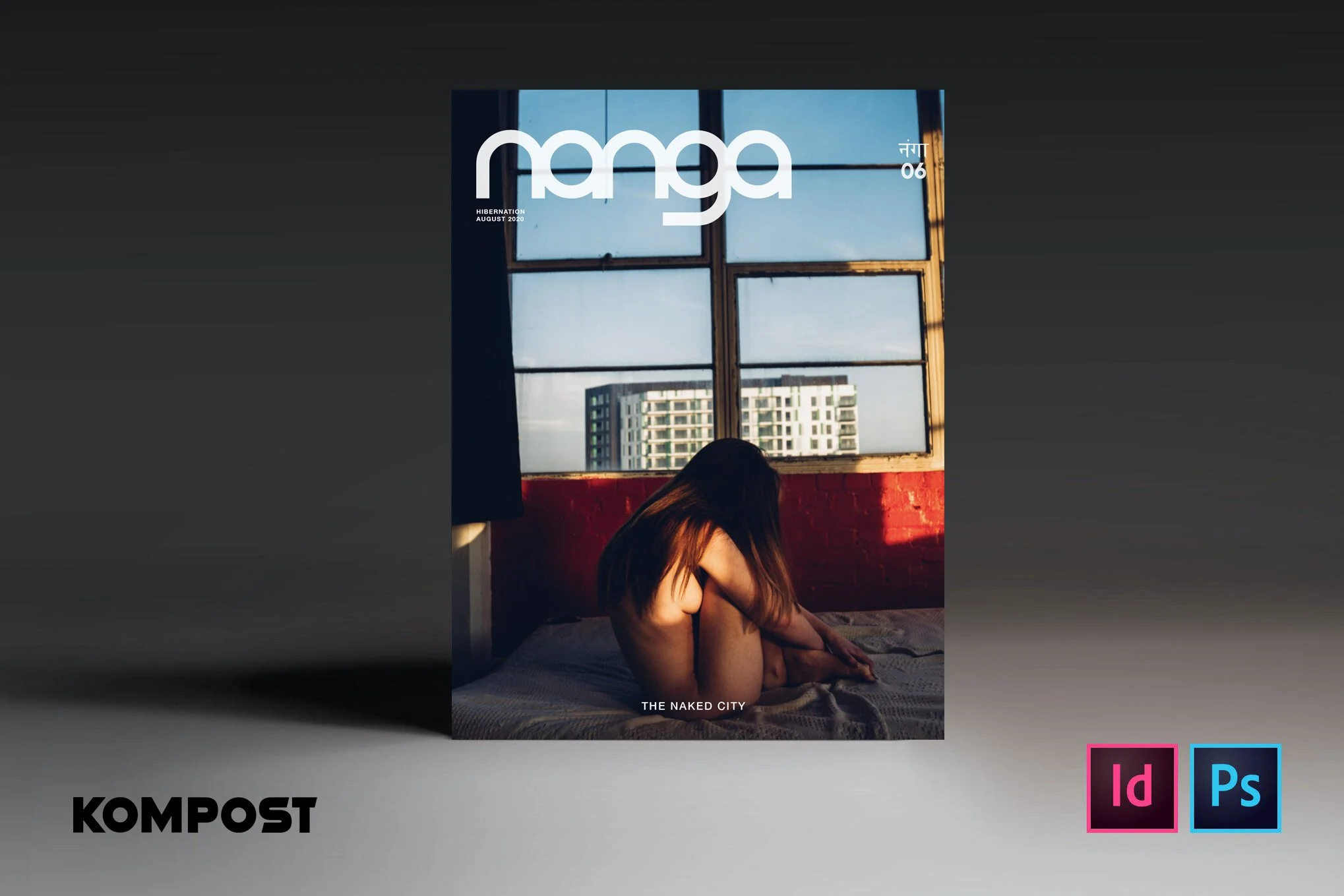
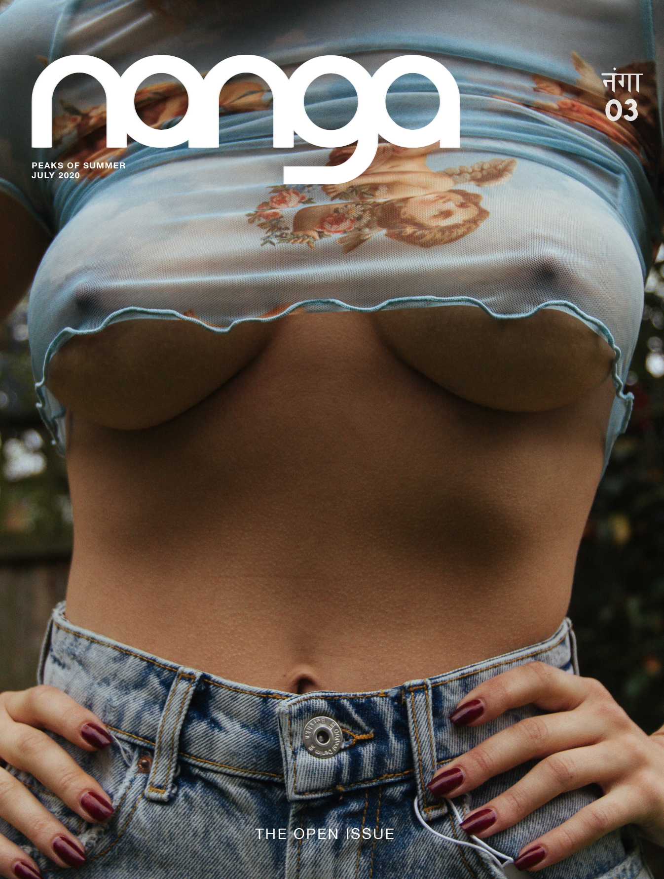
- Nanga began with a vision. An idea to shake up the arts establishment and take on provocative issues that we need to talk about. Concentrating on the politics of the body, Nanga challenges perceptions, aesthetics and ideas around it that make it taboo.

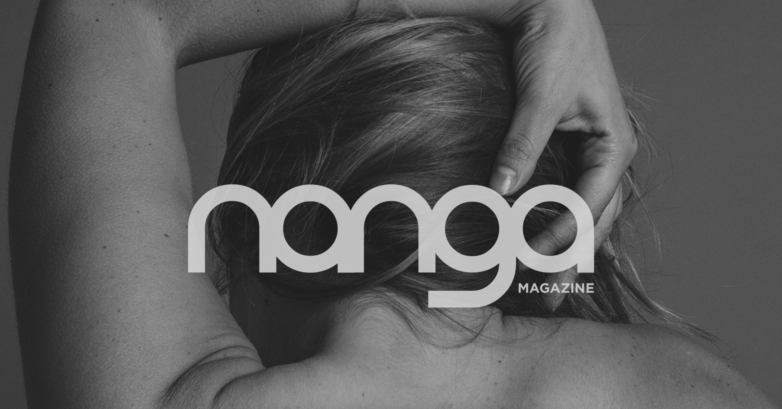
Nanga: Design Brief
- Nanga is ‘bare’ in Sanskrit. A word that literally means just that. Without any accoutrements, clothes or judgement. And only once you see an idea in its purest, barest form do you really start seeing something else. The logo was devised as a part of the body - a manifestation of the male gaze, a phallic symbol, smooth and inviting assimilated into the discourse.
Nanga is a culture
- To pay tribute to the word and to complete the circle we ensured we did a logo in DEVNAGRI as well.
